Lecture 9 - Data Visualization with Matplotlib

![]()
9.1 Introduction to Matplotlib
Matplotlib is a plotting library for Python created by John D. Hunter in 2003. Matplotlib is among the most widely used plotting libraries and is often the preferred choice for many data scientists and machine learning practitioners. The Matplotlib gallery on the official website at https://matplotlib.org/gallery/index.html contains code examples for creating various kinds of plots.
Matplotlib has two general interfaces for plotting: a state-based approach that is similar to Matlab’s way of plotting, and a more Pythonic object-oriented approach. We will start with discussing the state-based approach, and continue afterward with the object-oriented approach.
The main plotting functions of Matplotlib are contained in the pyplot module, which is almost always imported as plt.
[1]:
import matplotlib.pyplot as plt
9.2 The State-based Approach
As we mentioned, the state-based approach was developed based on the way plotting is done in Matlab. I.e., we call different functions that each take care of an aspect of the plot.
Let’s create a few plots to show how the state-based approach works.
[2]:
y = [2, 4, 1, 6, 7]

plt.plot(y, 'o')  # plot the data
plt.show()  # this line visualizes the plot
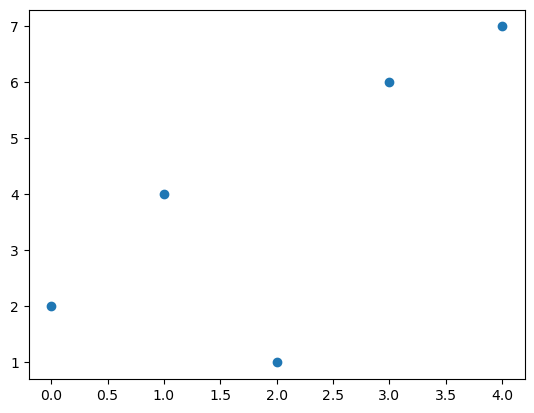
As you can see, the state-based approach includes a function call to plt.plot and afterward we call plt.show to show the plot in the notebook (or if we run this code from a script, the plot will show in an external image viewer ). Note that technically the plt.show call is not necessary to render the plot in Jupyter notebooks, but it is recommended to do it anyway as it is good practice.
In the above plot we provided only the list y, and Matplotlib plotted each value using the indices in the list for the x-axis. I.e., the value 4 has coordinate 1 on the x-axis, and value 6 has coordinate 3 on the x-axis. The string 'o' in plt.plot indicates that we didn’t want to plot a line, but we wanted to plot the values with circle markers.
Also, when working with Jupyter notebooks, each line of code that is part of the same plot should be defined in the same cell. Otherwise, the elements of the plot won’t be included in the same figure.
If we pass two arguments to plt.plot, then the first argument will represent the positions on the x-axis, and the second argument will represent the positions on the y-axis. This is shown in the next cell.
[3]:
x = [3, 4, 5, 6, 7, 8, 9]
y = [1, 2, 3, 4, 5, 6, 7]

plt.plot(x, y)  # plot the data
plt.xlabel('x', fontsize=12)  # set the x-axis label
plt.ylabel('y', fontsize=12)  # set the y-axis label
plt.show()  # this line visualizes the plot

Axis Labels
When graphing data, it is always a good idea to provide axis labels. In the above graph, we used plt.xlabel and plt.ylabel to provide the corresponding labels for the x-axis and y-axis. And, we can also control the size of axes labels by assigning a value to the keyword fontsize.
Controlling Line Properties
The plt.plot function is the most basic function to create any plot of paired data points (x, y). By default, it creates a line plot (as shown above), but there are many optional parameters in plt.plot allowing to create many different variations. For example, instead of a line, we can plot the data as separate red markers by specifying the marker format in the third argument 'o' to indicate points/circles as markers, and the color by setting the argument c for color
to 'red'.
[4]:
plt.plot(x, y, 'o', c='red')
plt.show()

## This above plt.plot function is equivalent to:
# plt.plot(x, y, marker='o', color='red', linestyle='')
## And is also equivalent to:
# plt.plot(x, y, 'ro')

In the next cell, the third argument is related to the line format and may be used to specify three things at once: whether we want markers (and which type of marker), whether we want a line (and which type of line), and which color the markers/line should have. So, to create a blue line, you may specify '-b'. To create a yellow ('y') dashes-dots line ('-.') with star markers ('*'), we can use '*-.y'.
[5]:
plt.plot(x, y, '*-.y')
plt.show()

Matplotlib also allows defining colors by using the color keyword argument, where several basic colors can be defined with their names (e.g., “red” below), or many colors can be definted with their RGB hex codes.
[6]:
import numpy as np
x = np.linspace(0, 5, 10)

plt.plot(x, x+1, color="red")
plt.plot(x, x+2, color="#1155dd")        # RGB hex code for a bluish color
plt.plot(x, x+3, color="#15cc55")        # RGB hex code for a greenish color
plt.show()

The supported color abbreviations with the single letter codes include:
character |
color |
|---|---|
b |
blue |
g |
green |
r |
red |
c |
cyan |
m |
magenta |
y |
yellow |
k |
black |
w |
white |
The formats for line styles include the following:
character |
description |
|---|---|
- |
solid line style |
– |
dashed line style |
-. |
dash-dot line style |
: |
dotted line style |
The following symbols can be used to specify markers:
character |
description |
|---|---|
. |
point marker |
, |
pixel marker |
o |
circle marker |
v |
triangle_down marker |
^ |
triangle_up marker |
< |
triangle_left marker |
> |
triangle_right marker |
1 |
tri_down marker |
2 |
tri_up marker |
3 |
tri_left marker |
4 |
tri_right marker |
s |
square marker |
p |
pentagon marker |
* |
star marker |
h |
hexagon1 marker |
H |
hexagon2 marker |
+ |
plus marker |
x |
x marker |
D |
diamond marker |
d |
thin_diamond marker |
‘ |
vline marker |
**_** |
hline marker |
Line and Marker Styles
We can also use other keywords to enter various other information in plt.plot. To change the line width, we can use the linewidth or lw keyword argument. The line style can be selected using the linestyle or ls keyword arguments. Similarly, the marker type and marker size can be selected using the marker and markersize keyword arguments.
[7]:
plt.figure(figsize=(12,6))

plt.plot(x, x+1, color="blue", linewidth=0.5)
plt.plot(x, x+2, color="blue", linewidth=1.5)
plt.plot(x, x+3, color="blue", linewidth=2.0)
plt.plot(x, x+4, color="blue", linewidth=4.0)

# possible linestyle options ‘-‘, ‘--’, ‘-.’, ‘:’
plt.plot(x, x+5, color="red", lw=2, linestyle='-')
plt.plot(x, x+6, color="red", lw=2, ls='-.')
plt.plot(x, x+7, color="red", lw=2, ls=':')

# possible marker symbols: marker = '+', 'o', '*', 's', ',', '.', '1', '2', '3', '4', ...
plt.plot(x, x+9, color="green", ls='', marker='+')
plt.plot(x, x+10, color="green", ls='', marker='o')
plt.plot(x, x+11, color="green", ls='', marker='s')
plt.plot(x, x+12, color="green", ls='', marker='1')

# marker size and color
plt.plot(x, x+13, color="purple", ls='', marker='o', markersize=2)
plt.plot(x, x+14, color="purple", ls='', marker='o', markersize=4)
plt.plot(x, x+15, color="purple", ls='', marker='o', markersize=8, markerfacecolor="red")
plt.plot(x, x+16, color="purple", ls='', marker='s', markersize=8,
        markerfacecolor="yellow", markeredgewidth=2, markeredgecolor="blue")
plt.show()

Multiple Lines in a Plot
We can plot multiple lines within a single plot, by calling plt.plot (or any other plotting function) multiple times. Below, we used two plt.plot functions to plot the squared values in the same figure.
Legend
Importantly, we can include a legend showing what each line represents using plt.legend. For the legend we pass a list or tuple of legend strings for the previously defined lines or curves. For the legend to be displayed correctly, the order of the labels ['y', 'y squared'] needs to match the order of the plotting calls. We can also specify the preferred location of the legend with the keyword loc.
[8]:
plt.plot(x, x, '*b')  # only plot markers (*) in blue
plt.plot(x, x**2, '^--y')  # plot both markers (^) and a dashed line (--) in yellow

# Note that the plt.legend function call should come *after* the plotting calls
# and you should give it a *list* with strings
plt.legend(['y', 'y squared'], loc='upper left')
plt.show()

Another method for adding a legend is to use the label='label_text' keyword argument when plots are added to the figure, and then use the legend method without arguments, as shown in the code below. The advantage of this method is that if lines/curves are added or removed from the figure, the legend is automatically updated accordingly.
One more thing to notice in the plot below is that when we plot multiple items in the same figure, if we don’t specify the format and color, Matplotlib will automatically choose a different color for the different items (first one is blue, second one is orange, third one is green, etc.).
[9]:
plt.plot(x, x, label='y')
plt.plot(x, x**2, label='y_square')
plt.plot(x, x**3, label='y_cube')
plt.legend()
plt.show()

Anatomy of a Figure
A general anatomy of a figure is shown below depicting the different items and properties of a figure.
 Figure source: Reference [3].
Figure Title, Ticks, Tick Labels
Matplotlib provides various functions to modify figures, and for instance, if we wish we can add a title with plt.title or change the default ticks and tick labels using plt.xticks (for the x-axis ticks/tick labels) and plt.yticks (for the y-axis ticks/tick labels). An example follows below, which shows how we can set custom tick labels for each tick position.
[10]:
plt.title("Plot with modified x-axis ticks and tick labels!", fontsize=12)
plt.plot(x, x**2)
plt.xticks([0, 2, 4, 6], ['0th', '2nd', '4th', '6th'])  # a list of x-axis positions, followed by a list of x-tick labels
plt.grid(True)
plt.show()

Range
Also, we can control the range of the axes by the functions plt.xlim and plt.ylim.
[11]:
plt.plot(x, x**2)
plt.xlim(-1, 8)
plt.ylim(-1, 28)
plt.show()

Similarly, we can control the range with the plt.axis() function which takes a list of arguments [xmin, xmax, ymin, ymax].
[12]:
plt.plot(x, x**2)
plt.axis([-1, 8, -1, 28])
plt.show()

9.3 Figure Size, Aspect Ratio, and DPI
Matplotlib allows to specify the aspect ratio, DPI (dots-per-inch resolution), and figure size by calling the plt.figure function, and using the figsize and dpi keyword arguments. figsize is a tuple of the width and height of the figure in inches, and dpi is the dots-per-inch (pixel per inch) resolution. The larger the DPI, the larger the resolution of the figure.
If we don’t include any arguments in plt.figure, Matplotlib creates a new figure with default size of 6.4 x 4.8 inches, and a default DPI of 100.
The following example is used to create an 8x4 inches figure (width x height) with 100 DPI, that is, the figure is 800x400 pixels.
[13]:
plt.figure(figsize=(8,4), dpi=100)
plt.plot(x, x)
plt.plot(x, x**2)
plt.plot(x, x**3)
plt.legend(['y', 'y square', 'y_cube'])
plt.show()

Similarly, the following figure is 2x6 inches (width x height) with 100 DPI, i.e., it is 200x600 pixels.
[14]:
plt.figure(figsize=(2,6), dpi=100)
plt.plot(x, x)
plt.plot(x, x**2)
plt.plot(x, x**3)
plt.legend(['y', 'y square', 'y_cube'])
plt.show()

9.4 Saving Figures
To save a figure to a file we can use the plt.savefig function with the name of the figure as argument. By using the .png file suffix in the name "figure_1.png" below, we chose to save the figure in the PNG file format.
[15]:
plt.figure(figsize=(4,4))
plt.plot(x, x)
plt.plot(x, x**2)
plt.plot(x, x**3)
plt.legend(['y', 'y square', 'y_cube'])
# plt.show() - this line is not needed when saving a figure
plt.savefig("figure_1.png")

We can also optionally specify the DPI of the figure in plt.savefig(), as well as choose another output format (e.g., JPG).
[16]:
plt.figure(figsize=(4,4))
plt.plot(x, x)
plt.plot(x, x**2)
plt.plot(x, x**3)
plt.legend(['y', 'y square', 'y_cube'])
plt.savefig("figure_2.jpg", dpi=200)

Matplotlib can generate high-quality figures in various formats, including PNG, JPG, EPS, SVG, PGF, and PDF. The file format can be conveniently specified via the file suffix (.eps, .svg, .jpg, .png, .pdf, .tiff). Using a vector graphics format (.eps, .svg, .pdf) is often recommended, because it usually results in smaller file sizes than bitmap graphics (.jpg, .png, .bmp, .tiff) and does not have a limited resolution.
[17]:
plt.figure(figsize=(4,4))
plt.plot(x, x)
plt.plot(x, x**2)
plt.plot(x, x**3)
plt.legend(['y', 'y square', 'y_cube'])
plt.savefig("figure_3.pdf", dpi=200)

9.5 Other Plotting Functions
Scatter Plots
There are many different plotting functions in Matplotlib besides plt.plot. Scatterplots can be created using plt.scatter.
[18]:
x2 = np.linspace(0, 10, 100)
plt.scatter(x2, np.sin(x2))  # This is equivalent to plt.plot(x, y, 'o') !
plt.title("Scatterplot", fontsize=12)
plt.show()

[19]:
plt.scatter(x2, np.sin(x2), color='green', marker='+')
plt.show()

Bar Plots
Bar graphs are created using plt.bar. We pass in a list of values or strings for the x-axis, and a list of heights for the bars on the y-axis. We can optionally set a color for the bars (and if we don’t, the default color is blue).
[20]:
# First argument determines the location of the bars on the x-axis
# and the second argument determines the height of the bars
bar_labels = ['bar 1', 'bar 2', 'bar 3']
means = [5, 8, 10]
plt.bar(bar_labels, means)
plt.title("Bar Plot", fontsize=12)
plt.show()

We can also add error bars to the bar plot using the yerr (y-error) keyword in plt.bar.
[21]:
bar_labels = [1, 2, 3]
means = [5, 8, 10]
variances = [1, 2, 4]
plt.bar(bar_labels, means, yerr=variances, color='gold')
plt.title("Bar Plot", fontsize=12)
plt.show()

And, we can create horizontal bar plots using plt.barh. In this case, the first argument is a list of positions on the y-axis, and the second argument is a list of values of the bars along the x-axis.
[22]:
labels = ['Electric', 'Solar', 'Diesel', 'Unleaded']
values = [2, 1, 4, 6]
plt.barh(labels, values, color='cyan')
plt.show()

Histograms
The function plt.hist is used for this purpose.
[23]:
# Let's generate some random data from normal distribution
random_norm = np.random.randn(1000)

plt.title("Histogram", fontsize=12)
plt.hist(random_norm)
plt.xlabel("Value", fontsize=10)
plt.ylabel("Frequency", fontsize=10)
plt.show()

Histograms of 2 normal distributions with different mean and variance values are shown below. Note that the alpha keyword controls the transparency level of the histograms, where 0.3 corresponds to 30% transparency. The bins keyword controls the number of bins to divide the values in the distributions.
[24]:
# Mean 0 and variance 20
random_norm1 = 0 + 20*np.random.randn(1000)
# Mean 15 and variance 10
random_norm2 = 15 + 10*np.random.randn(1000)

# fixed bin size
bins = np.arange(-100, 100, 5)

plt.hist(random_norm1, bins=bins, facecolor='c', alpha=0.5)
plt.hist(random_norm2, bins=bins, facecolor='r', alpha=0.3)
plt.show()

Boxplots
The function plt.boxplot can be used to plot the distribution of data with a boxplot, showing the median of the data (the vertical line in the middle), the interquartile ranges (i.e., the ends of the boxes represent 25 and 75 percentiles), and the minimum and maximum values of the data (that is, the far end of the lines extending from the boxes, referred to as “whiskers”). The values outside of the whiskers are outliers in the data.
Boxplots for the two random distributions from the previous example are shown below.
[25]:
plt.boxplot([random_norm1, random_norm2])
plt.show()

9.6 Multiple Plots in Figures
Matplotlib allows creating several plots in the same figure. This allows working with multiple datasets at once. There are several different ways to do this. The simplest way is to create a new figure to add the second plt.plot function.
Here we created two line plots. When we called plt.figure(2), it created a top-level container for the plt.plot function that follows after it. Thus, the first plot is added to figure one (which is created automatically when plt.plot is called), and the second plot is added to figure 2. When we call show() at the end, Matplotlib will open two windows with each graph shown separately.
[26]:
numbers1 = [2, 4, 1, 6]
numbers2 = [5, 1, 10, 3]

plt.plot(numbers1, '*b')

second_plot = plt.figure(2)
plt.plot(numbers2, 'or')
plt.show()


Matplotlib also supports adding two or more plots to a single figure, by using the function subplot. The arguments in subplot define the number of rows, the number of columns, and the number of each subplot.
[27]:
plt.subplot(1,2,1)
plt.plot(x, x**2, 'r--')
plt.subplot(1,2,2)
plt.plot(x, x**3, 'g*-');

In the following figure, the right plots use a logarithmic scale with the function plt.yscale("log"). One more thing to note is that the arguments in plt.subplots do not need to be separated by commas.
[28]:
plt.subplot(221)
plt.plot(x, x**2)
plt.title("Normal scale (x^2)")

plt.subplot(222)
plt.plot(x, x**2)
plt.yscale("log")
plt.title("Logarithmic scale (x^2)")

plt.subplot(223)
plt.plot(x, np.exp(x))
plt.title("Normal scale (exp(x))")

plt.subplot(224)
plt.plot(x, np.exp(x))
plt.yscale("log")
plt.title("Logarithmic scale (exp(x))")

plt.tight_layout()

9.7 The Object-oriented Approach
The state-based plotting approach in Matplotlib is easy to use and pretty straightforward, however for creating more complex visualizations, the alternative object-oriented approach provides advantages.
The main idea of the object-oriented approach in Matplotlib is to create objects to which we can apply methods. In this approach, each Matplotlib plot consists of a Figure object and one or more Axes objects. Essentially, the Figure object represents the entire canvas that defines the figure. The Axes objects contain the actual visualizations that we want to include in the Figure. This is shown below. However, note that an Axes object is different than the axes (x-axis and y-axis) of a plot. And, there may be one or multiple Axes objects within a given Figure (e.g., two line plots next to each other).
The real advantage of this approach becomes apparent when more than one figure is created, or when a figure contains more than one subplot.
 Figure source: Reference [3].
To use the object-oriented approach, we create a new Figure object that defines the canvas to draw on by using plt.figure(). In the next cell, we passed the newly created Figure instance to the fig name. As we explained before, plt.figure can take optional arguments like figsize (width and height in inches) and dpi.
Next, from the Figure class instance fig we create a new Axes instance axes using the add_axes method. In the object-oriented approach, plotting is done through the methods of the newly created axes object, instead of the function plot (or scatter, bar) from the pyplot module. And, even in the object-oriented approach we need the function plt.show to render the figure.
[29]:
fig = plt.figure()

axes = fig.add_axes([0, 0, 0.8, 0.8]) # left, bottom, width, height (range 0 to 1)

axes.plot(x, x**2, 'r')
axes.set_xlabel('x')
axes.set_ylabel('y')
axes.set_title('title')
plt.show()

Basically all functions from the state-based approach are available as methods in the object-oriented approach. Also, some pyplot functions are prefixed with set_ in the object-oriented interface. For instance, plt.title or plt.xlabel functions used with the state-based approach, in the object-oriented approach are replaced with axes.set_title or axes.set_xlabel.
The advantage of the object-oriented approach is that it enables having full control of where the plot axes are placed, and we can easily add more than one axis to the figure.
[30]:
fig = plt.figure()

axes1 = fig.add_axes([0, 0, 0.8, 0.8]) # main axes
axes2 = fig.add_axes([0.1, 0.4, 0.4, 0.3]) # inset axes

# main figure
axes1.plot(x, x**2, 'r')
axes1.set_xlabel('x')
axes1.set_ylabel('y')
axes1.set_title('Main Figure Title', fontsize=12)

# insert
axes2.plot(x**2, x, 'g')
axes2.set_xlabel('y')
axes2.set_ylabel('x')
axes2.set_title('Insert Figure Title', fontsize=10)

fig.savefig("figure_4.jpg", dpi=200)

In the above example, we saved the figure using the method fig.savefig, instead of plt.savefig that we used in the state-based approach.
Instead of creating the Figure and Axes objects separately, we can use the function plt.subplots to create them both at the same time, as in the next example. As the name suggests, this function also allows to create multiple subplots where each subplot corresponds to one Axes object). The plt.subplots function accepts as arguments the number of rows and columns nrows and ncols, and optionally the figure size.
[31]:
fig, axes = plt.subplots(nrows=1, ncols=3, figsize=(10, 3))
plt.show()

Let’s check out the type of the variable axes in the above code.
[32]:
type(axes)
[32]:
numpy.ndarray
When we create a figure with more than one Axes object, the function plt.subplots returns axes as a numpy ndarray. To access the individual Axes objects from the numpy array, we can index them axes[0], axes[1], as in the next cell.
[33]:
fig, axes = plt.subplots(nrows=1, ncols=3, figsize=(10, 3))

axes[0].plot(x, x, 'r')
axes[0].set_xlabel('x')
axes[0].set_ylabel('y')
axes[0].set_title('Subfigure 1.1')

axes[1].plot(x, x**2, 'g')
axes[1].set_xlabel('x')
axes[1].set_ylabel('y')
axes[1].set_title('Subfigure 1.2')

axes[2].plot(x, x**3, 'b')
axes[2].set_xlabel('x')
axes[2].set_ylabel('y')
axes[2].set_title('Subfigure 1.3')

plt.show()

Note also that the above figure has overlapping figures and labels for the y-axis. To deal with that, we can use fig.tight_layout method, which automatically adjusts the positions of the axes on the figure canvas so that there is no overlapping content.
[34]:
fig, axes = plt.subplots(nrows=1, ncols=2)

for ax in axes:
    ax.plot(x, x**2, 'r')
    ax.set_xlabel('x')
    ax.set_ylabel('y')
    ax.set_title('title')

fig.tight_layout()

Another way to add sub-figures in Matplotlib is by using the subplot2grid function, which allows to specify the length of the span of the subplots across columns or rows.
[35]:
fig = plt.figure()
ax1 = plt.subplot2grid((3,3), (0,0), colspan=3)
ax2 = plt.subplot2grid((3,3), (1,0), colspan=2)
ax3 = plt.subplot2grid((3,3), (1,2), rowspan=2)
ax4 = plt.subplot2grid((3,3), (2,0))
ax5 = plt.subplot2grid((3,3), (2,1))
fig.tight_layout()

Annotating text in Matplotlib figures can be done using the text function. It supports LaTeX formatting just like axis label texts and titles. Also, the spines function provides control of the appearance of the borders in the figure.
[36]:
fig, ax = plt.subplots()

ax.spines['right'].set_color('blue')
ax.spines['top'].set_color('red')
ax.spines['left'].set_color('green')

ax.xaxis.set_ticks_position('bottom')
ax.yaxis.set_ticks_position('right')

ax.plot(x, x**2, x, x**3)

ax.text(4, 25, r"$y=x^2$", fontsize=12, color="blue")
ax.text(3.6, 80, r"$y=x^3$", fontsize=12, color="green")

plt.show()

And, here is one more example where sine wave plots are created with different frequencies and amplitudes.
[37]:
def create_sine_wave(timepoints, frequency=1, amplitude=1):
    """ Creates a sine wave with a given frequency and amplitude for a given set of timepoints.

    Parameters
    ----------
    timepoints : list
        A list with timepoints (assumed to be in seconds)
    frequency : int/float
        Desired frequency (in Hz.)
    amplitude : int/float
        Desired amplitude (arbitrary units)

    Returns
    -------
    sine : list
        A list with floats representing the sine wave
    """
    sine = [amplitude * math.sin(2 * math.pi * frequency * t) for t in timepoints]
    return sine


import math
timepoints = [i / 100 for i in range(500)]

# in the next line, sharex=True and sharey=True are used to force the same range across subplots
fig, axes = plt.subplots(ncols=3, nrows=3, figsize=(10, 10), sharex=True, sharey=True)
amps = [1, 2, 4]
freqs = [1, 3, 5]
for i in range(len(amps)):
    for ii in range(len(freqs)):
        sine = create_sine_wave(timepoints, frequency=freqs[ii], amplitude=amps[i])
        axes[i, ii].plot(timepoints, sine)
        axes[i, ii].set_title(f"Freq = {freqs[ii]}, amp = {amps[i]}")
        axes[i, ii].set_xlim(0, max(timepoints))
        if ii == 0:
            axes[i, ii].set_ylabel("Activity", fontsize=12)

        if i == 2:
            axes[i, ii].set_xlabel("Time", fontsize=12)

fig.tight_layout()
plt.show()

Appendix
The material in the Appendix is not required for quizzes and assignments.
Formatting Text in Matplotlib with LaTeX
Matplotlib has great support for LaTeX, by using dollar signs to encapsulate LaTeX in any text, such as legend, title, label, etc. (for example, "$y=x^3$").
However, we can run into a slight problem with LaTeX code and Python text strings. In LaTeX, we frequently use the backslash in commands, for example \alpha to produce the symbol \(\alpha\). But the backslash already has a meaning in Python strings (the escape code character). To avoid problems in Python with Latex code, we need to use “raw” text strings that are prepended with an ‘r’, like r"\alpha" instead of "\alpha".
[38]:
fig, ax = plt.subplots()

ax.plot(x, x**2, label=r"$y = \alpha^2$")
ax.plot(x, x**3, label=r"$y = \alpha^3$")
ax.legend(loc='upper left')
ax.set_xlabel(r'$\alpha$', fontsize=18)
ax.set_ylabel(r'$y$', fontsize=18)
ax.set_title('Title of Appendix Figure');

We can also change the global font size and font family, which applies to all text elements in a figure (tick labels, axis labels and titles, legends, etc.).
[39]:
import matplotlib

# Update the matplotlib configuration parameters:
matplotlib.rcParams.update({'font.size': 18, 'font.family': 'serif'})
[40]:
fig, ax = plt.subplots()

ax.plot(x, x**2, label=r"$y = \alpha^2$")
ax.plot(x, x**3, label=r"$y = \alpha^3$")
ax.legend(loc=2) # upper left corner
ax.set_xlabel(r'$\alpha$')
ax.set_ylabel(r'$y$')
ax.set_title('Title of Appendix Figure');

And, we can restore the font and font size back to the defaults.
[41]:
# restore
matplotlib.rcParams.update({'font.size': 12, 'font.family': 'sans'})
Colormap and Contour Figures
Colormaps and contour figures are useful for plotting functions of two variables. In most of these functions we will use a colormap to encode one dimension of the data. There are a number of predefined colormaps, and it is relatively straightforward to define custom colormaps.
The following cell defines a two-dimensional function, and afterward, plotting the colormap is illustrated with: pcolor, imshow, and contour. The function fig.colorbar is used to add a colorbar.
[42]:
# Create a two dimensional function
phi_m = np.linspace(0, 2*np.pi, 100)
phi_p = np.linspace(0, 2*np.pi, 100)

alpha = 0.7
phi_ext = 2 * np.pi * 0.5

def flux_qubit_potential(phi_m, phi_p):
    return 2 + alpha - 2 * np.cos(phi_p) * np.cos(phi_m) - alpha * np.cos(phi_ext - 2*phi_p)

X,Y = np.meshgrid(phi_p, phi_m)
Z = flux_qubit_potential(X, Y).T
pcolor
[43]:
fig = plt.figure()
ax = fig.add_axes([0, 0, 0.8, 0.8])

p = ax.pcolor(X/(2*np.pi), Y/(2*np.pi), Z, cmap=matplotlib.cm.RdBu, vmin=abs(Z).min(), vmax=abs(Z).max())
cb = fig.colorbar(p, ax=ax)

imshow
[44]:
fig = plt.figure()
ax = fig.add_axes([0, 0, 0.8, 0.8])

im = ax.imshow(Z, cmap=matplotlib.cm.RdBu, vmin=abs(Z).min(), vmax=abs(Z).max(), extent=[0, 1, 0, 1])
im.set_interpolation('bilinear')

cb = fig.colorbar(im, ax=ax)

contour
[45]:
fig = plt.figure()
ax = fig.add_axes([0, 0, 0.8, 0.8])

cnt = ax.contour(Z, cmap=matplotlib.cm.RdBu, vmin=abs(Z).min(), vmax=abs(Z).max(), extent=[0, 1, 0, 1])

3D Figures
To use 3D graphics in Matplotlib, we first need to create an instance of the Axes3D class. 3D axes can be added to a matplotlib figure in exactly the same way as 2D axes. Or, they can be added by passing a projection='3d' keyword argument to the add_axes or add_subplot methods.
[46]:
from mpl_toolkits.mplot3d.axes3d import Axes3D
Surface plots
[47]:
fig = plt.figure(figsize=(14,6))

# `ax` is a 3D-aware axis instance because of the projection='3d' keyword argument to add_subplot
ax = fig.add_subplot(1, 2, 1, projection='3d')
p = ax.plot_surface(X, Y, Z, rstride=4, cstride=4, linewidth=0)

# surface_plot with color grading and color bar
ax = fig.add_subplot(1, 2, 2, projection='3d')
p = ax.plot_surface(X, Y, Z, rstride=1, cstride=1, cmap=matplotlib.cm.coolwarm, linewidth=0, antialiased=False)
cb = fig.colorbar(p, shrink=0.5)

Wire-frame plot
[48]:
fig = plt.figure(figsize=(8,6))

ax = fig.add_subplot(1, 1, 1, projection='3d')

p = ax.plot_wireframe(X, Y, Z, rstride=4, cstride=4)

Contour plots with projections
[49]:
fig = plt.figure(figsize=(8,6))

ax = fig.add_subplot(1,1,1, projection='3d')

ax.plot_surface(X, Y, Z, rstride=4, cstride=4, alpha=0.25)
cset = ax.contour(X, Y, Z, zdir='z', offset=-np.pi, cmap=matplotlib.cm.coolwarm)
cset = ax.contour(X, Y, Z, zdir='x', offset=-np.pi, cmap=matplotlib.cm.coolwarm)
cset = ax.contour(X, Y, Z, zdir='y', offset=3*np.pi, cmap=matplotlib.cm.coolwarm)

ax.set_xlim3d(-np.pi, 2*np.pi);
ax.set_ylim3d(0, 3*np.pi);
ax.set_zlim3d(-np.pi, 2*np.pi);

Change the view angle
We can change the perspective of a 3D plot using the view_init method, which takes two arguments: elevation and azimuth angle (in degrees).
[50]:
fig = plt.figure(figsize=(12,6))

ax = fig.add_subplot(1,2,1, projection='3d')
ax.plot_surface(X, Y, Z, rstride=4, cstride=4, alpha=0.25)
ax.view_init(30, 45)

ax = fig.add_subplot(1,2,2, projection='3d')
ax.plot_surface(X, Y, Z, rstride=4, cstride=4, alpha=0.25)
ax.view_init(70, 30)

fig.tight_layout()

References
Matplotlib - Pyplot Tutorial, available at: https://matplotlib.org/2.0.2/users/pyplot_tutorial.html.
Lectures on Scientific Computing with Python, Robert Johansson, available at: https://github.com/jrjohansson/scientific-python-lectures/blob/master/Lecture-4-Matplotlib.ipynb.
Introduction to Matplotlib (tutorial), by Lukas Snoek, available at: https://lukas-snoek.com/introPy/solutions/week_1/2_matplotlib.html.
Matplotlib - An Intro to Creating Graphs with Python, Mike Driscol, available at: https://www.blog.pythonlibrary.org/2021/09/07/matplotlib-an-intro-to-creating-graphs-with-python/.
Scientific Computing in Python: Introduction to NumPy and Matplotlib, by Sebastian Raschka, available at: https://sebastianraschka.com/blog/2020/numpy-intro.html.
Python Tutorial, Visualization with Matplotilb, available at: https://github.com/zhiyzuo/python-tutorial/blob/master/4-Visualization-with-Matplotlib.ipynb.
Numpy, Pandas, Matplotlib Tutorial, available at https://github.com/veb-101/Numpy-Pandas-Matplotlib-Tutorial.
BACK TO TOP